Wednesday, October 31, 2012
Saturday, October 27, 2012
Thursday, October 18, 2012
POUCHES.
But what the heck is going on with this picture.
 |
| What. |
I don't even know. Apparently this guy is all about drawing huge muscles, and massive guns (maybe they need the muscles to lift their guns?) and putting straps on things, and hanging pouches everywhere. And not being good at drawing hands. Or any anatomy. And hiding the feet. And I can't even show you any of his women.
I don't want to bash the guy too bad. His pictures are certainly dynamic and dramatic. But it's actually rather reassuring to think that if a guy like this could make it big in the industry...
Sunday Doodles #3
Today's sketches are for my BFA project (the art equivalent of an undergraduate thesis), which means I was kind of doing schoolwork during church but not really because they're not for a class and they're supposed to be part of my ongoing development as an artist and it's partly for pleasure and it helps me pay attention so there. I'm doing concept art for So You Want to Be a Wizard by Diane Duane, which is one of my favorite books ever. These first sketches are for the main characters, Nita and Kit, nerds and brand new wizards out to battle the forces of darkness and entropy.
Tuesday, October 16, 2012
Drawing the undead just in time for Halloween!
Drawing these guys for character design was super fun. As my husband is discovering, I really really really love Halloween. I love fall in general, I love dressing up in costumes, and I love things that are creepy and spooky but not really SCARY. So drawing a bunch of undead warrior zombies was the perfect project for me.
I was actually rather terrified of these guys as a child.
Tuesday, October 9, 2012
Hexaflexagons!
No Sunday doodles this week (although General Conference was lovely and everyone should watch/listen to it!) but I present an intriguing little invention that kept us entertained for Saturday night and the larger part of Sunday: Hexaflexagons!
They're like the much-awesomer version of elaborately decorated cootie catchers that you made in middle school. This video is an entertaining introduction and gives you the basics on how to make one. They are pretty dang cool. And a single one entertained a backseat full of twenty-somethings for an entire car trip, so there you go.
Tuesday, October 2, 2012
A Buffet Project
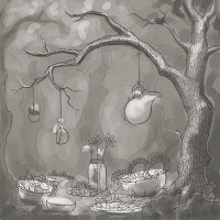
This is the first fully-(almost) finished piece of the semester, and the first in a long time since I was so busy over the summer. I sketched a ton but never took anything farther than that. So it was kind of nice to devote a lot of time to just one thing, to leave it and come back to it and really work out a lot of details.
The assignment was based on the description of this competition my professor found, of which the theme is buffet. (The brief waxes very poetic about "the world is a table" and "a convivial gathering" and "maybe even finding the great love of life." You can pretty much tell that it was translated from Italian.)
I started thinking about the games my siblings and I used to play in the backyard when we were little, and no matter what it was it usually involved some kind of feast, and therefore we had to gather and prepare food. We could pretty much turn anything from the outdoors into a banquet. So that's the idea that I went with.
I sketched up a rough drawing in Photoshop, did a value study over it, and then did more refined linework over that.
I was trying to focus on the contrasts between light and dark and warm and cool colors, so I played with a couple different ideas of warm yellow light against darker cool shadows.
The one I went with in the end was based off the third thumbnail, with a blue-green base, but I put a lot more warmth into it as I went to make it a little more summery and lively. Overall I think my attention to contrast led to a much more solid piece than I've had in the past. Having the lights and shadows clearly separated in value as well as color made the whole thing read better and look more lifelike. And I'm quite pleased with the shades of green I've achieved in the background.
Subscribe to:
Comments (Atom)


